← All Work
Web App · UX Research · Responsive Design

Gyanshala

A responsive redesign for a Jain Sunday school serving nearly 100 families.

Role UX Designer
Timeline 8 Weeks
Tools Figma · Procreate · Claude Code
Platform Tablet & Mobile Web
The Design Challenge

How might we make community education as easy to access as it is to teach?

Creating one reliable destination where Gyanshala parents could quickly find schedules, classwork, homework, and learning resources.

The Problem

12 clicks per child. 24 if you have two.

The experience was built around administrative structure instead of the way families actually searched for information. For parents managing multiple children, even simple weekly tasks became frustratingly time consuming.

01

Fragmented information

Schedules, homework, and updates were split between the website and WhatsApp.

02

Too many clicks

Finding one week's classwork meant navigating through subject pages, archives, dates, and homework sections every visit.

03

Built for admins

Navigation reflected internal organisation, not the questions parents actually asked like "What was taught this week?"

UX Audit

The original site, annotated.

Original JVBNA Gyanshala website 1 2 3 4 5 6
1
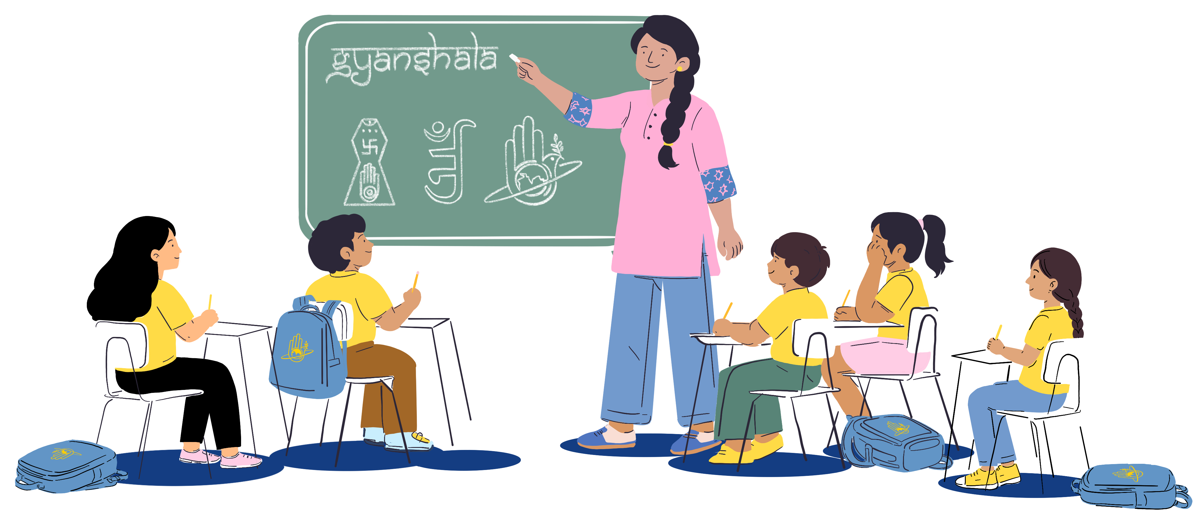
Administrative title

"2025-26 JVBNA Gyanshala Classwork & Homework" reads like a filing label, not a parent-facing homepage.

2
Equal weight everywhere

Every subject button looked identical, making it difficult to understand hierarchy, grouping, or relevance.

3
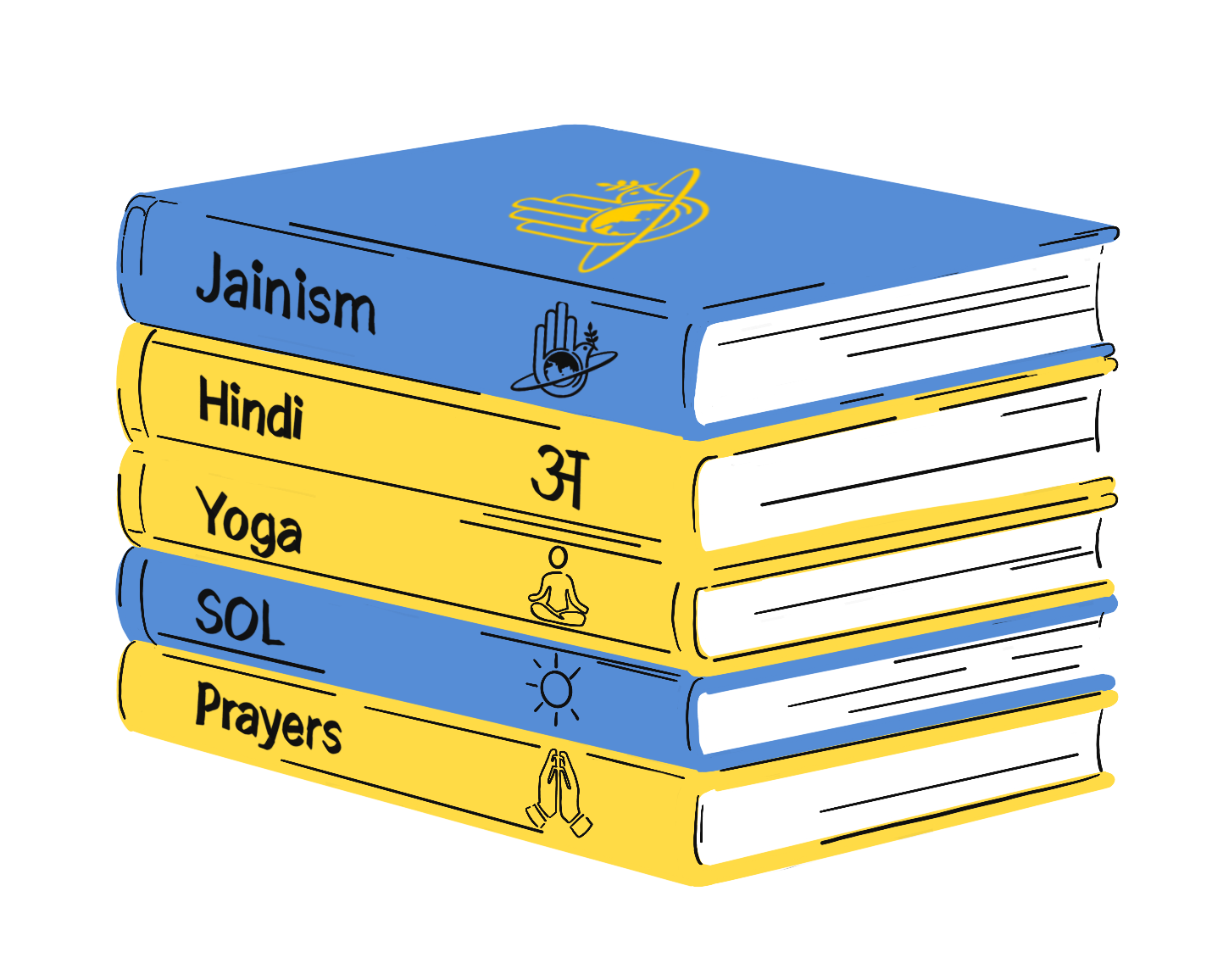
Navigation built around subjects, not tasks

Parents searched for questions like "What was taught this week?" but the experience was organised around subject archives instead.

4
Truncated labels

Content titles were cut off mid sentence, reducing clarity and scanability.

5
No warmth or visual identity

Dark navy buttons, repetitive layouts, and the absence of imagery made the experience feel administrative rather than like a place where children learn, connect, and belong.

6
No schedule anywhere

The entire site had no answer to "when is class?" That information only existed in the WhatsApp group.

Approach

Four principles that guided the redesign

The redesign started with a simple question: what does a parent actually need the moment they open the site? Every decision followed from there.

01

Content first

The week's class schedule, homework, and key updates appear immediately without requiring multiple navigation steps.

02

Mobile first

Most parents accessed the site on phones, so every screen was designed for small screens first and then adapted for larger devices.

03

One destination per question

Navigation labels were rewritten around the questions parents actually asked, reducing guesswork and unnecessary browsing.

04

Warm, community centred design

Illustration, colour, and typography were used intentionally to make the experience feel approachable, familiar, and family focused rather than administrative.

Custom Illustration

Custom illustrations created from scratch

The original site had no imagery, limited colour, and little sense of warmth or community. The redesign took inspiration directly from the students themselves, from yellow Gyanshala t-shirts to blue Gyanshala bags and familiar classroom moments. Every character was illustrated by hand using details families would instantly recognise, giving the experience a sense of personality, familiarity, and belonging.

Teacher at the front of a Gyanshala classroom with students at their desks
Two students walking to school
Girl reading and raising her hand
Two kids reading together
Stack of subject books
Calendar with marked dates
Where illustration meets UX

18 years of visual storytelling informed the UX approach behind Gyanshala. Illustration was used as a functional design tool to create familiarity, emotional clarity, and a stronger sense of community throughout the experience.

18
years of illustration

Design Impact

From friction to flow

Every design decision maps directly to a friction point in the original experience.

Before Decision After
24 clicks to find classwork and homework One time login and weekly classwork surfaced directly from the home screen Faster access with fewer navigation steps
Back and forth between website and WhatsApp to find info Everything in one place on the website One reliable destination for information
Admin-labelled navigation Nav labels match parent questions Less guessing, faster understanding
Important information was buried deep within pages Prioritize high need content using progressive disclosure and clear hierarchy Critical information visible immediately
Fully functional — scroll, tap, and navigate inside either device

Responsive across every screen

01 Start on Home and see this week's class at a glance — no clicking required
02 Tap "This Session" to see the full class breakdown: subject, homework, and classwork
03 Try "Schedule" to see the full year, then "Syllabus" to explore what subjects are taught
Reflection

What I learned

01

Audit before redesign

Mapping the full parent journey before touching the interface revealed where the real friction existed and prevented superficial design fixes.

02

Labels shape usability

Rewriting navigation around parent questions improved clarity more than any visual change.

03

Mobile constraints improve hierarchy

Designing for small screens first forced clearer prioritization and reduced unnecessary complexity across the entire experience.

04

Warmth builds trust

Illustration, colour, and tone helped transform the experience from administrative to community centered without adding complexity.

Next Case Study EasyMoney

Reducing financial anxiety one interaction at a time.

View EasyMoney →